


What Is a CSS Grid? The CSS grid layout (also referred to as "the grid") was proposed to the CSS Working Group by Microsoft and the Grid Layout Working Draft was first published in April 2011.
Over time, this specification has been improved thanks to feedback from developers and browser vendors who work together to make the grid a truly effective layout solution.
The grid acts as an addition to CSS that allows you to control the size and placement of grid items. You can use media queries to automatically adapt your grids to diverse contexts.
Benefits of a CSS Grid Thanks to its flexibility, a CSS grid allows web designers to achieve almost any type of layout that they need. It's great for dividing up the major regions of a page into smaller sections or setting the relationship between elements in terms of size and position.
While it aligns page elements by columns and rows just like tables, the grid isn't limited by a particular content structure. This makes it possible to create a wider variety of website layouts than would be practical with tables alone.
Additionally, without a content structure, the grid layout can easily adapt to changes in device, space, and orientation without requiring a semantic change in the content. You can rearrange grid elements — no matter their source order — which makes it possible to fit the layout to the context without changing the underlying markup.
A powerful auto-placement feature lets you easily fill up available space, eliminating the need for complex calculations. The grid even allows you to overlap items when you need to, which is definitely not possible with tables.
Now that we're familiar with the CSS grid, let's explore how to use it.
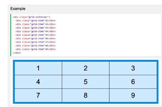
Grid items are the direct children of the grid container. They are arranged vertically into columns and horizontally into rows.
The space between a row and a column is called a gap. You can adjust the gap using these properties:
grid-column-gap, which defines the gap between columns;
grid-row-gap, which defines the gap between rows; or
grid-gap, which is a shorthand property for grid-column-gap and grid-row-gap. In between columns and rows, there are lines referred to as column lines and row lines, respectively. We can see an example of this below.