


What is CSS Flexbox? Crafting intelligent page layouts with CSS has been tricky in years past. Before flexbox was introduced, web developers had to use floats and table display hacks, often leading to unexpected issues. The CSS flexbox model introduced a cleaner modern syntax for crafting intelligent layouts.
The flexbox model provides for an efficient way to lay out, align, and distribute space among elements, even when the viewport and element size is dynamic or unknown.
Flexbox is a whole CSS module, not a single property, so there’s a lot to cover to master this powerful tool. We’ll try to cover the most important ones as we go.
To start using the flexbox model, we first define a flex-container. Let’s see how that’s done. First, look at some regular HTML.
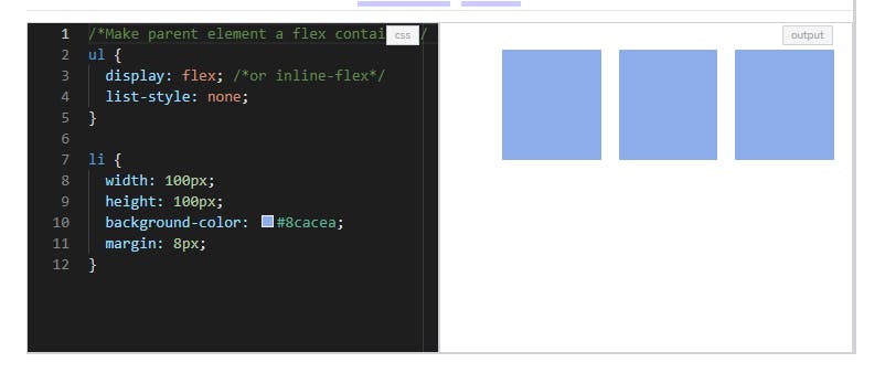
You do this by setting display: flex or display: inline-flex for the inline variation.
As you can see, items are laid out following either the cross axis (from cross-start to cross-end) or main axis (from main-start to main-end).
flex-direction: controls the direction in which the flex-items are laid along the main axis main axis: this is the primary axis that flex items are laid out along. It is not always horizontal. main-start/main-end: flex items are set within a container starting from the main-start to main-end main size: an item’s width or height will be the main size (whichever is in the main dimension) cross axis: This is the axis that is perpendicular to the main axis. cross-start/cross-end: flex lines are set within a container starting from the cross-start side to the cross-end side cross size: width or height of a flex item is the item’s cross size (whichever is in the cross dimension)
flex-direction flex-direction determines the main-axis, so it defines the direction that flex items are set in the container.
Generally speaking, flexbox is a single-direction layout concept, so they are either in horizontal rows or vertical columns.
.container { flex-direction: row | row-reverse | column | column-reverse; }
flex-wrap Flex items will try to fit onto one line by default. We can change this with flex-wrap. The flex wrap property can take on three values:
//where ul represents a flex container ul { flex-wrap: wrap || no-wrap || wrap-reverse; } nowrap (default): flex items are on one line wrap: flex items are wrapped onto multiple lines (top to bottom) wrap-reverse: flex items are wrapped onto multiple lines (from bottom to top)
justify-content justify-content is for alignment along the main axis. The three flex-items may be aligned across the main-axis however you need. This property takes on any of the values below.
ul { justify-content: flex-start || flex-end || center || space-between || space-around } flex-start (default): items are placed at the start of flex-direction flex-end: items are placed at the end of flex-direction. start: items are placed at the start of the writing-mode direction center: items are centered space-between: items are evenly distributed space-around: items are evenly distributed with equal space between and around them align-items align-items defines how your flex-items are laid out on the cross axis. It can be set to any of these values:
/ul represents any flex container/ ul { align-items: flex-start || flex-end || center || stretch || baseline } stretch (default): items will fill the container flex-start / start / self-start: items are placed at the start of the cross axis flex-end / end / self-end: items are placed at the end of the cross axis center: items are centered along the cross-axis baseline: items are aligned along their baselines
order The order property allows you to reorder the flex items. Basically, you can move a flex-item from one position to another. The default value for the order property is 0. It may take on either negative or positive values.
Flex items are re-ordered based on the number values of the order property, from lowest to highest. For example:
.item { order: 5; / default is 0 / } flex-grow and flex-shrink The flex-grow and flex-shrink properties control how much a flex-item can grow (extend) if there are extra spaces or shrink if there are no extra space. They may take up any values ranging from 0 to any positive number.
For example, if all flex items have flex-grow set to 1, then the remaining space is equally distributed to the other children items.
The value 0 is like a “turn-off” switch for this property.
.item { flex-grow: 3; / default 0 / } .item { flex-shrink: 2; / default 1 / } flex basis The flex-basis property specifies the initial size of a flex-item, which can be a length (e.g. 20%) or a keyword. For example, the auto keyword states that the width or height property is used.
.item { flex-basis: | auto; / default auto / } Let’s set a flex-item to a fixed width:
ul { display: flex; border: 1px solid red; padding: 0; list-style: none; background-color: #e8e8e9; }
li { flex-basis: auto;
flex The flex shorthand allows you set the flex-grow, flex-shrink, and flex-basis properties at once.
li { flex: 0 1 auto; } Here, the code is equal to setting the three properties: flex-grow: 0; flex-shrink: 1; flex-basis: auto.