


Introduction to Responsive Web Design: Pseudo-elements, Media Queries, and More Nowadays, your website will be visited by a wide variety of devices: desktops with large monitors, mid-sized laptops, tablets, smartphones, and more. To achieve an optimal user experience, your site should be adjusting its layout in response to these varied devices (i.e., to their varied screen resolutions and dimensions). The process of responding to the form of the user’s device is referred to as (you guessed it) responsive web design (RWD).
The Responsive Web Design Approach What’s commonly glossed over about RWD is that it’s not just about adjusting the appearance of your webpages; instead, the focus should be on logically adapting your site for usage across different devices. For example: using the mouse does not provide the same user experience as, say, the touchscreen. Don’t you agree? Your responsive mobile vs. desktop layouts should reflect these differences.
At the same time, you don’t want to be completely rewriting your site for each of the tens of different screen sizes on which it might be viewed—such an approach is simply infeasible. Instead, the solution is to implement flexible responsive design elements that use the same HTML code to adjust to the user’s screen size.
We can also define different styles within the same CSS stylesheet such that they are only utilized if certain constraints are satisfied. For example, this portion of our responsive CSS would only be used if the current device had a width above 480px:
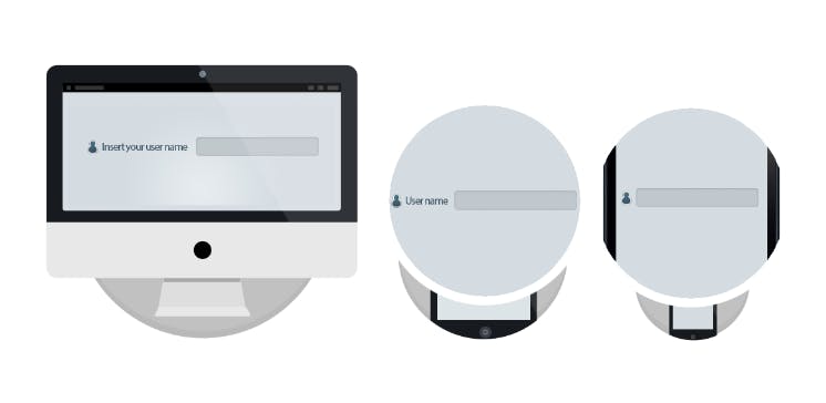
@media screen and (min-width: 480px) { div { float: left; background: red; } ....... } Here’s a simple responsive design example in which we create three different layouts for a login button, one apiece for desktop, tablet, and smartphone. On the smartphone, we’ll have a lone icon, while the tablet will have the same icon accompanied by “User name”. Finally, for the desktop, we’ll also add a short instructional message (“Insert your user name”).
.username:after { content:"Insert your user name"; }
@media screen and (max-width: 1024px) { .username:before { content:"User name"; } }
@media screen and (max-width: 480px) { .username:before { content:""; } }